Women in Congress – MakeoverMonday W42 2018

Women in Congress, 1917-2018: Service Dates and Committee Assignments by Member, and Lists by State and Congress. Datasource is Congress research service. here is the original visualisation

Party Differences - Mobile.png

It shows the crux of the data very well. I like the viz. I wanted to show a bit more information and also compare how the current congress is doing compared to previous 5 and then comparing them to the rest. Also categorise the data between Democrats and republicans. The color yellow symbolises the latest and we are comparing it with the rest. We are also comparing it to the highest percentage of women reprentative. The dataviz is comparing the percentage of women reprentatives and how it has turned out for each Democrats and Republicans with each congress.

Dashboard 1 (13).png


Paying The President: W38 2018

Trump has been a menace and an eye sore in the world of politics since the day he decided to stand as a Presidential cnadidate. “Make America Great Again” is becoming more and more a necessity as days go by and we wake up to Trump ruling the U.S.A. This dataviz was one of my favourites as it showcases how Trump and his associates has been abusing the system since his presidential campaign and it’s still continuing.

Here is the original viz in pro publica.

Paying the President.jpg


Honestly I loved this viz. It conveys the message accross and highlights all the critical areas. Hard to top the original one.

In my viz I have used pareto chart to identifiy where did the Trump administration spent most of tax payers money. I have also used an interactive scatter plot which changes with each type of spending, with the month/year as the X axis and $ value as the Y axis.

Also this time I have added an info icon with information on how to read the chart while also highlighting that some of the data is missing for a certain period in the source file.

Dashboard 1 (12).png


Train Vs Plane: MakeOverMonday W38 2018

Pretty simple dataset but datavisualization can do wonders in pointing out the outliers and getting audiences focus in areas the dataviz author wants to. Here is the original viz.

supporting image or chart

I like the original viz because it’s neat and gets the message accross by comparing the ticket prices w.r.t to how many weeks ahead they were bought. So the data is a comparison of the variance of Plane and Train ticket prices for different source and destinations.

I had been itching to create a viz using Jump plot, that I have learnt after reverse engineering @NilsM09 and @MarkBradbourne vizes. This data was pretty apt for that. Had to do some dataprep using Alteryx.

Alteryx Jump.jpg

In the viz, the x axis signifies the % difference between ticket prices of Train and Plane. While the hieght of the jump plot signifies the Train tickets price. The outcome is quite surprising, given that sometimes the Train ticket prices are higher than flight prices, although it’s not often.


Dashboard 1 (11).png

Avocado Price: MakeoverMonday W40 2018

This particular one was a bit interesting as the data was in very detailed format. There was a lot of interesting and wonderful dashboards already created by the makeover monday crew and I was wondering how to visualise the data a bit more differently. Before we get there here is an overview of the original visualisation.

Avocado Original.jpg

Its an average overall dataviz.

What I wanted to do was to compare the average and total price of avocado quarterly. In order to do so I decided to blend and edit the data in Alteryx. The idea was to get the Weeks for each date, then to which quarter of the year it belongs to and lastly count the weeks for each quarter and reset the week to 1 for each quarter.

Avocado Alteryx WF.jpg

In the final dataviz I have got a line chart comparing current quarter with the previous quater and the previous year’s same quarter as current quarter.

Look at total price of Avocado region wise. Look at QTD total price, volume, days left. Glimps of last 5 days total Avocado price. Also a quaterly metric of total price for conventional and organic Avocado.

Dashboard 1 (10).png


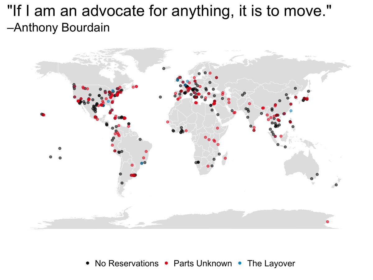
MakeoverMonday W33 3018, Anthony Bourdain’s Travel

It is awful how many well-known personalities we’ve lost in recent times to depression, a disease not to be taken lightly. Anthony Bourdain is well known for his exploration of world culture and cuisine; however, I had no idea that in the past 16 years of his career he has traveled to 362 cities all over the world! (thanks to this week’s MakeoverMonday). I liked him because, unlike other chefs, not only was he a good chef, but also he was an enabler of socio-cultural awareness.

This week the original data viz was from Christine Zhang .

supporting image or chart

I wanted to use simple line and bar graphs this time. Analyzing the cities Anthony visited in the last 16 years, I went ahead and created the viz below, which shows us the following things:

  1. The number of cities visited per show in each region
  2. Distinct count of cities visited in each region
  3. From year 2002 to 2016, the count of cities visited region-wise with max/min indicator on the spark line.

To create the spark lines with min/max I got help from this video of none other than Andy Kriebel

My first viz was as shown below:

Anthony 1.jpg

However, Eva Murray quite helpfully pointed this out:

My bad, fair point (thank you). Here is the revised viz:

Anthony Bourdain.png

On a side note, please remember that you are very much loved and wanted in this world. Happy data vizing everyone.


Makeover Monday W28 – 2018, Volcano Eruptions

It was a very informative Makeover Monday this time. I had to go through a few articles to understand the data-set properly. I have a little better understanding of which countries have volcanoes and what the main rock type or the primary volcano type is, and about the ring of fire etc.

I liked the original viz. Please see below:

original visualization

It denotes different volcano types with different shapes and colored with respect to the eruption date from past to present, representing past to present as lighter to darker.

What I tried to do is to focus on one of the countries. My pick was Japan, including Japan administered by Russia. My aim was to:

  1. Have a closer look at the volcanoes on the map to know their exact location,
  2. Highlight the main volcano type in Japan, and
  3. Visually represent the volcanoes below and above sea level.

Japan is heavily affected by volcanoes and hence I thought it would be a good pick for analysis. Please find my viz below.

Volcanic Eruptions In Japan


Click here for interactive viz


Monday Makeover W27-2018 – Rat Sightings in NYC

New York city is densely populated by rats. It doesn’t matter if the area is highly populated or less populated. They are all over the place. They can pick up disease and can be carriers, causing more destruction to the environment. In this week’s Makeover Monday we have tried to recreate the data viz originally done by Jowanza Joseph . It’s very well done.

What I tried to do is:

  • Created another viz to compare the 2017 Rat Sighting with other years, month-wise
  • Show a heat map of Rat sighting reported year-wise
  • See how the different boroughs of NYC did with Rat Sighting from 2010 to 2018

Dashboard 1 (7).png

Interactive Viz here.

Here is the post code map.

Dashboard 1 (5).png

Interactive viz here


Design a site like this with WordPress.com
Get started