Australian Permanent Visa Statistics

This is very close to my heart as I myself migrated to this country more than a decade ago. The visa laws change every year. More and more people from all over the world migrate to countries like Australia for a better future and life. Australia government has to understand the deficit of skilled workers in the country, which changes every year, and change the visa rules accordingly.  The government is also very open to do business and innovation with citizens of other countries. This viz explores some of the main  permanent visas outcomes.


Dashboard 1 (3).png

click to view in Tableau Public

Tableau Desktop Associate Certification

2019-01-05_2-59-04.gif

I totally enjoyed this certification. While returning from work by train I decided to book the test and got a time slot for 5 am in the morning of the next day. The exam is mostly to test your skills with the tableau software. So knowing the software pretty well is necessary apart from following the syllabus alone.

During the exam you will be applying the software to derive your results. Data blending, joins, LODs, maps, histogram, trend line, dashboards (to name a few) etc. will be tested through some practical applications. Since I have been working in Tableau for a few years now I didn’t have to go through the videos but it’s highly recommended: the link is here. Tableau for Beginners by Lukas Halim has got two sample test papers that would allow one to have an idea of what the test will be like.

Time is very crucial for completing the test and hence good internet speed is essential. My home internet was showing me 0.9 mbps upload speed and I didn’t take any risk and used my mobile data instead. I can’t stress enough how important a good internet speed is. I was able to complete the test in 90 mins.

TABLEAU CERTIFICATE.png

You may also have a look at Alteryx Designer core certification tips here.

Alteryx Core designer Certification – Guide

2019-01-05_2-59-04


The above snippet is from my Tableau Public interactive resume. The pink circles on the timeline show all the certifications I have acquired so far.

This certification was so much fun to appear for. Before the exam, make sure your local computer has Alteryx (14 days Trial) installed. Duration is 2 hrs for 80 questions. Its a mix and match of almost all the important tools used in Alteryx. For more idea please go through the syllabus here.

  1. Register here, make sure to use your company email
  2. Go through the prep guide here
  3. The link arrives on the first day of the next month for registration
  4. You have 3 attempts each month; if you can’t clear in those 3 months, try again next month
  5. There are a few very good videos shared in the live training area of Alteryx

            a. Live Training: Core Certification Prep – Part I

            b. Live Training: Core Certification Prep – Part II

            c. Live Training: Core Certification Prep – Part III

d. 2018-11-20: Core Certification Prep – Part IV

The idea of the test is to get one familiarised with the Alteryx designer environment. So what we have to do (unless you know it already) is to try them out on the Alteryx designer itself. So it is very important to have the designer open in front of you. Also, if you know some of the answers, it will save you a lot of time.

The best way to prepare for this test is to play with each and every designer element. Weekly challenges are also another good way of getting yourself familiarised with the environment. If you have worked with Alteryx, this is a good way to remind yourself the basics of the tool.

Lastly there is a limit of 3 attempts every month until you clear the test. It’s free of cost. Get yourself some time and just go for an attempt; the tests themselves prepare you well for the tool.

All the best for your certification. I will be happy to answer any queries regarding the same.

Alteryx Core.png

To read more about Tableau Desktop Qualified Associate certification, please click here


Tableau Set Action Explained #WorkoutWednesday W44-45

Drilldown Final.gif

In the last 2 weeks right after or during the TC18, Tableau revealed a few very interesting features for Tableau 2018.3, one of which was an addition to our workbook / dashboard Action, which is ‘Change Set Values…’

The steps are very simple:

a. Create sets based on the drill down etc

b. Write a formula including the sets to make it behave as per your analysis

c. Create the set action and test your viz.

WorkoutWednesday Week 45

set action.png

The Tableau community has been very excited with this addition, and why not. It makes our lives much more easier when building dasboards in Tableau and when detailed analysis is required. Earlier it was possible but required lot of data modelling and was slower. Here I will explain how to use Set Action for interactivity by using these beautifully done Workoutwednesday dashboards by @AnnUJackson and @RodyZakovich.

Lets get into then. First of I will display the week 45th wow dashboard here.

set act 2.gif

Here is how it is done. (Set Action Only). Make sure in the ‘Marks’ it is a square not text.


  1. First of all, let’s create a parameter for the X axis which can be either Region or Segment; similarly create a parameter for Y axis which can be Category or Sub-Category. Now create calculated field X and Y, which is just to change the Values w.r.t the chosen option in the paramters. This is how the X looks like, see below. Y will be similar but will be along the Y axis parameter.tab X.png
  2.  Now create a set using the “X” and “Y” calculated fields. Remember the idea is to   highlight and not filter. So the sets will look like this, If X is ‘Region’ or Y is ‘Sub-Category’. It can be any row on which the mouse hovers over. set x.pngSet Y, similarly can be any column the mouse hovers over.set y.png
  3. Create a calculated field depending on the behaviour; we want a highlighted criss-cross, depending where the mouse is on the table. So the formula will be used in the color mark. So we will say if set X or Y then 1 else -1. In the color mark we will set it as max(selected) selected.png
  4. In the color pane give 1 the highlight color you like. color.png
  5. Final piece of the puzzle: create the action sets.Set XY.gifTest the set action and you are done.


WorkoutWednesday Week44

Now let’s have a look at other fantastic uses of Set Action.

Drilldown set.gif

Here are two seperate uses of set action, one being the line graph, wherein you can drill down into detailed date analysys from years to months etc.

Second is the tree map, wherein you can drill down till the product name level and its sales value.

  1. The time chart is simple – Sales on Y axis and Month on X axis. We created the set time, which includes all the months in the data set, and we will be using this to filter our next worksheet, which is the TreeMap. So we put the Set in the filter area and check ‘In’ only. Set this for both line chart and the tree map worksheet.month in.png
  2.  So we want to select smaller chunks of date ranges using our mouse and would want the viz to show the line chart only for that range. Simply creating the set action will allow us to achieve this, since we have the set in the filters panel. There’s no requirement of any calculated field. The “In” filter will take care of it as shown above.Drilldown stime sa.gif
  3. For the TreeMap, we have created one set for a combination of Category and Sub-Category and also a calculation field to make the set action to drill down to sub-category from categorycat sub.png
  4. The formula for drilling down to Sub-Category is dd subcat.png
  5. We will use this formula to create our second set, so that we can drill down further from the resultant Sub-Cat to Product name.set2.png
  6. Like always, here is the last step, creating the Set Action for drill down from Category -> SubCategory -> ProductnameDrilldown treemap.gif


Women in Congress – MakeoverMonday W42 2018

Women in Congress, 1917-2018: Service Dates and Committee Assignments by Member, and Lists by State and Congress. Datasource is Congress research service. here is the original visualisation

Party Differences - Mobile.png

It shows the crux of the data very well. I like the viz. I wanted to show a bit more information and also compare how the current congress is doing compared to previous 5 and then comparing them to the rest. Also categorise the data between Democrats and republicans. The color yellow symbolises the latest and we are comparing it with the rest. We are also comparing it to the highest percentage of women reprentative. The dataviz is comparing the percentage of women reprentatives and how it has turned out for each Democrats and Republicans with each congress.

Dashboard 1 (13).png


Paying The President: W38 2018

Trump has been a menace and an eye sore in the world of politics since the day he decided to stand as a Presidential cnadidate. “Make America Great Again” is becoming more and more a necessity as days go by and we wake up to Trump ruling the U.S.A. This dataviz was one of my favourites as it showcases how Trump and his associates has been abusing the system since his presidential campaign and it’s still continuing.

Here is the original viz in pro publica.

Paying the President.jpg


Honestly I loved this viz. It conveys the message accross and highlights all the critical areas. Hard to top the original one.

In my viz I have used pareto chart to identifiy where did the Trump administration spent most of tax payers money. I have also used an interactive scatter plot which changes with each type of spending, with the month/year as the X axis and $ value as the Y axis.

Also this time I have added an info icon with information on how to read the chart while also highlighting that some of the data is missing for a certain period in the source file.

Dashboard 1 (12).png


Train Vs Plane: MakeOverMonday W38 2018

Pretty simple dataset but datavisualization can do wonders in pointing out the outliers and getting audiences focus in areas the dataviz author wants to. Here is the original viz.

supporting image or chart

I like the original viz because it’s neat and gets the message accross by comparing the ticket prices w.r.t to how many weeks ahead they were bought. So the data is a comparison of the variance of Plane and Train ticket prices for different source and destinations.

I had been itching to create a viz using Jump plot, that I have learnt after reverse engineering @NilsM09 and @MarkBradbourne vizes. This data was pretty apt for that. Had to do some dataprep using Alteryx.

Alteryx Jump.jpg

In the viz, the x axis signifies the % difference between ticket prices of Train and Plane. While the hieght of the jump plot signifies the Train tickets price. The outcome is quite surprising, given that sometimes the Train ticket prices are higher than flight prices, although it’s not often.


Dashboard 1 (11).png

Avocado Price: MakeoverMonday W40 2018

This particular one was a bit interesting as the data was in very detailed format. There was a lot of interesting and wonderful dashboards already created by the makeover monday crew and I was wondering how to visualise the data a bit more differently. Before we get there here is an overview of the original visualisation.

Avocado Original.jpg

Its an average overall dataviz.

What I wanted to do was to compare the average and total price of avocado quarterly. In order to do so I decided to blend and edit the data in Alteryx. The idea was to get the Weeks for each date, then to which quarter of the year it belongs to and lastly count the weeks for each quarter and reset the week to 1 for each quarter.

Avocado Alteryx WF.jpg

In the final dataviz I have got a line chart comparing current quarter with the previous quater and the previous year’s same quarter as current quarter.

Look at total price of Avocado region wise. Look at QTD total price, volume, days left. Glimps of last 5 days total Avocado price. Also a quaterly metric of total price for conventional and organic Avocado.

Dashboard 1 (10).png


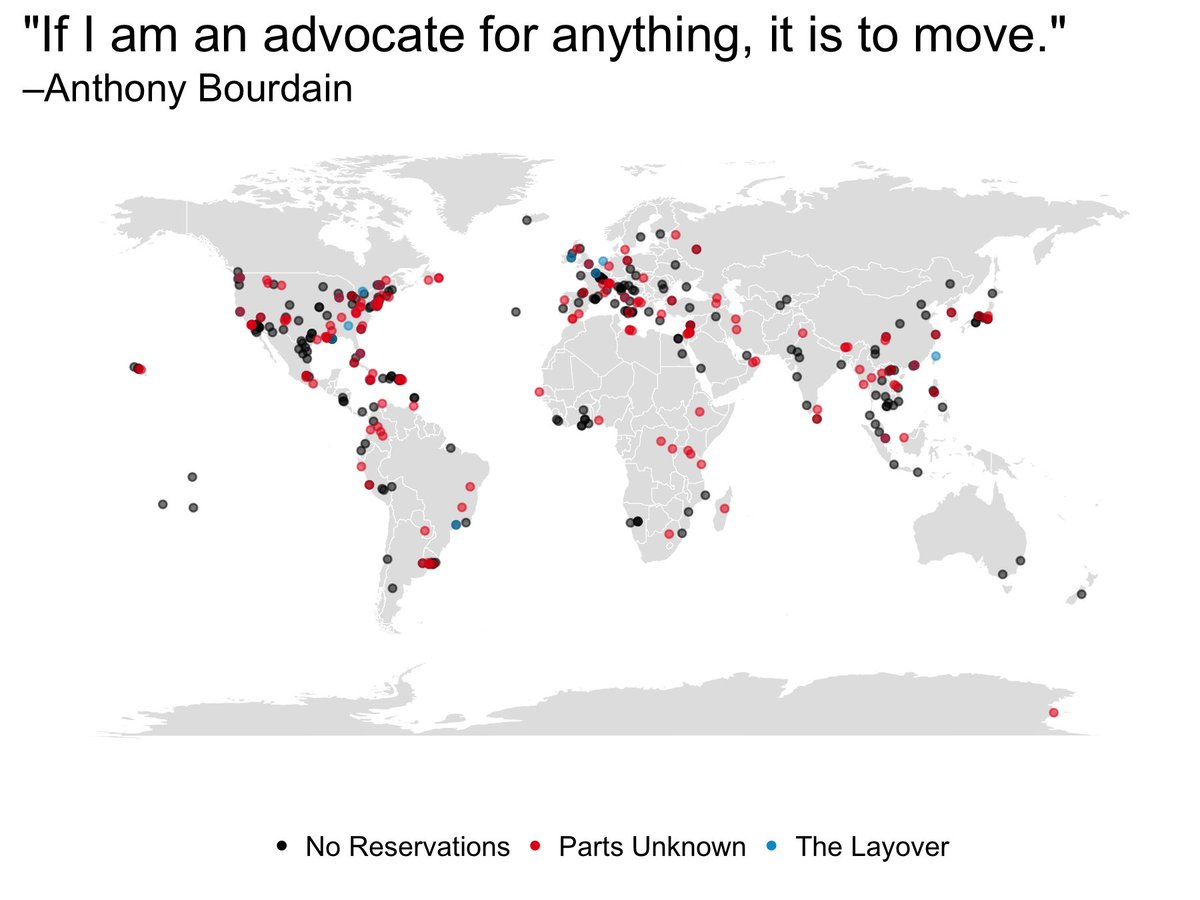
MakeoverMonday W33 3018, Anthony Bourdain’s Travel

It is awful how many well-known personalities we’ve lost in recent times to depression, a disease not to be taken lightly. Anthony Bourdain is well known for his exploration of world culture and cuisine; however, I had no idea that in the past 16 years of his career he has traveled to 362 cities all over the world! (thanks to this week’s MakeoverMonday). I liked him because, unlike other chefs, not only was he a good chef, but also he was an enabler of socio-cultural awareness.

This week the original data viz was from Christine Zhang .

supporting image or chart

I wanted to use simple line and bar graphs this time. Analyzing the cities Anthony visited in the last 16 years, I went ahead and created the viz below, which shows us the following things:

  1. The number of cities visited per show in each region
  2. Distinct count of cities visited in each region
  3. From year 2002 to 2016, the count of cities visited region-wise with max/min indicator on the spark line.

To create the spark lines with min/max I got help from this video of none other than Andy Kriebel

My first viz was as shown below:

Anthony 1.jpg

However, Eva Murray quite helpfully pointed this out:

My bad, fair point (thank you). Here is the revised viz:

Anthony Bourdain.png

On a side note, please remember that you are very much loved and wanted in this world. Happy data vizing everyone.


Design a site like this with WordPress.com
Get started